Rockbot Jukebox Apps
Rethinking the Rockbot App, making a jukebox in your pocket, more than just a jukebox.
Role
I was the sole lead designer, and helped steer product direction working alongside the engineering team and PM.
Problem
The Rockbot Jukebox App was difficult for users to find music (decreased engagement), confusing, and from an technical standpoint was difficult to build on top of. We took this opportunity to simplify this experience, make it more flexible to build into the future, and rethink what the Rockbot experience could be.
Goals
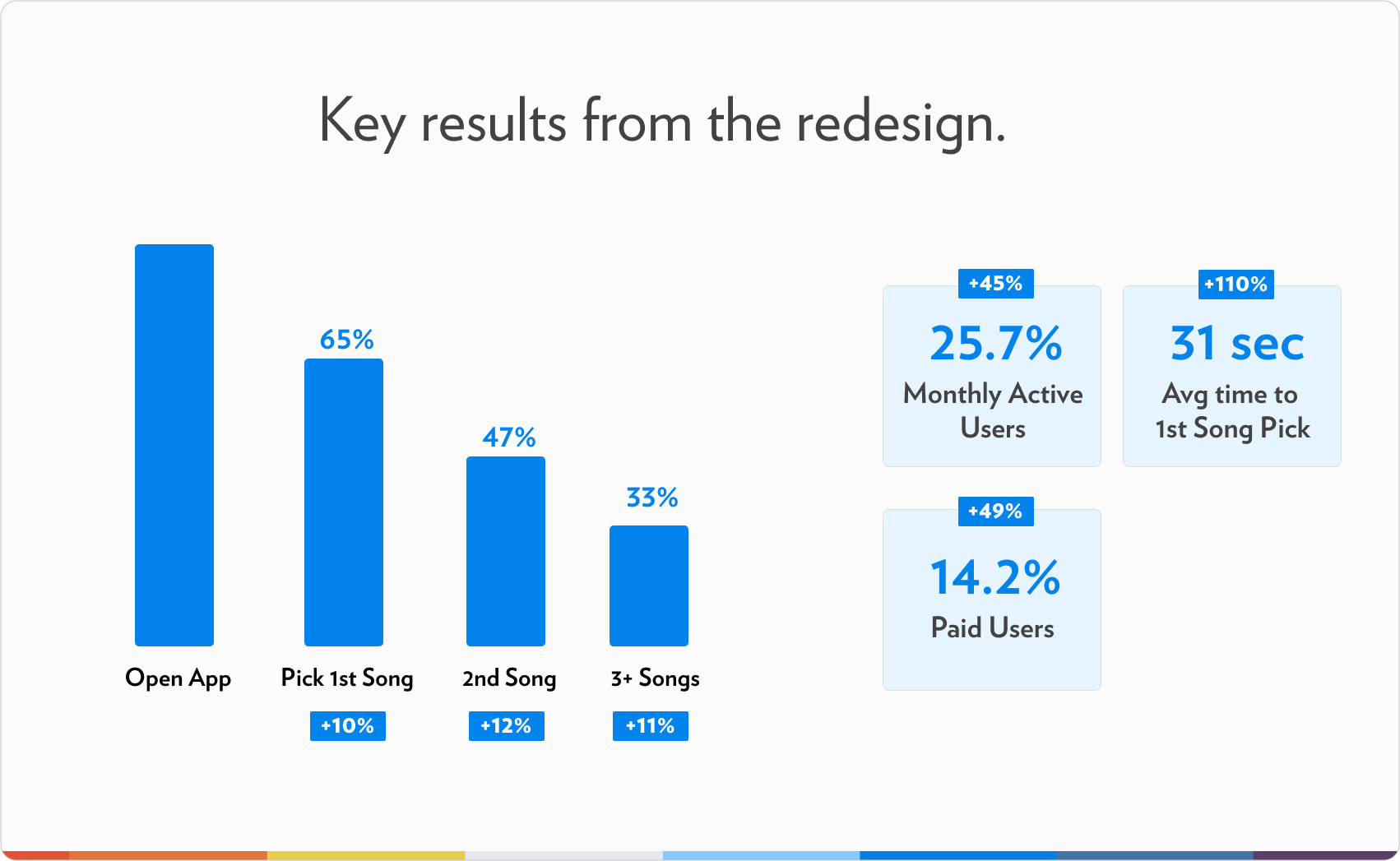
1. Make finding the music you love easy (Increase in song picks per user)
Finding music you loved wasn't easy or fun - with that there was an opportunity to increase engagement and get users coming back. We knew when users could find and play music they loved, they were roughly 3x more likely to keep using it.
2. Increase engagement (WAU/MAU)
Users loved Rockbot, but there was little reason to come back then to pick a song. We wanted to find ways to bring users in and keep them engaged within the experience.
3. Flexible design that can grow with the company's direction
The new experience had to be modular and flexible. Something that would allow Rockbot to test out different game mechanics, additional features, and play with new ideas as the company grew into the future.
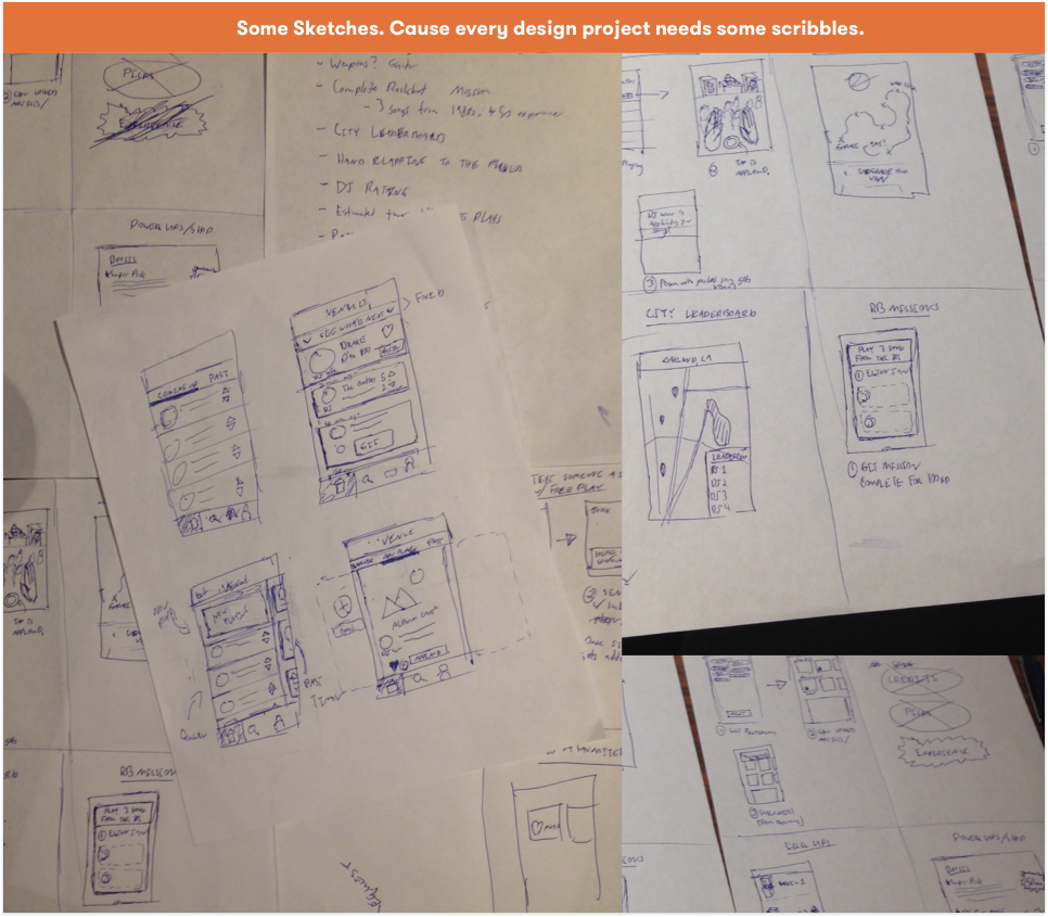
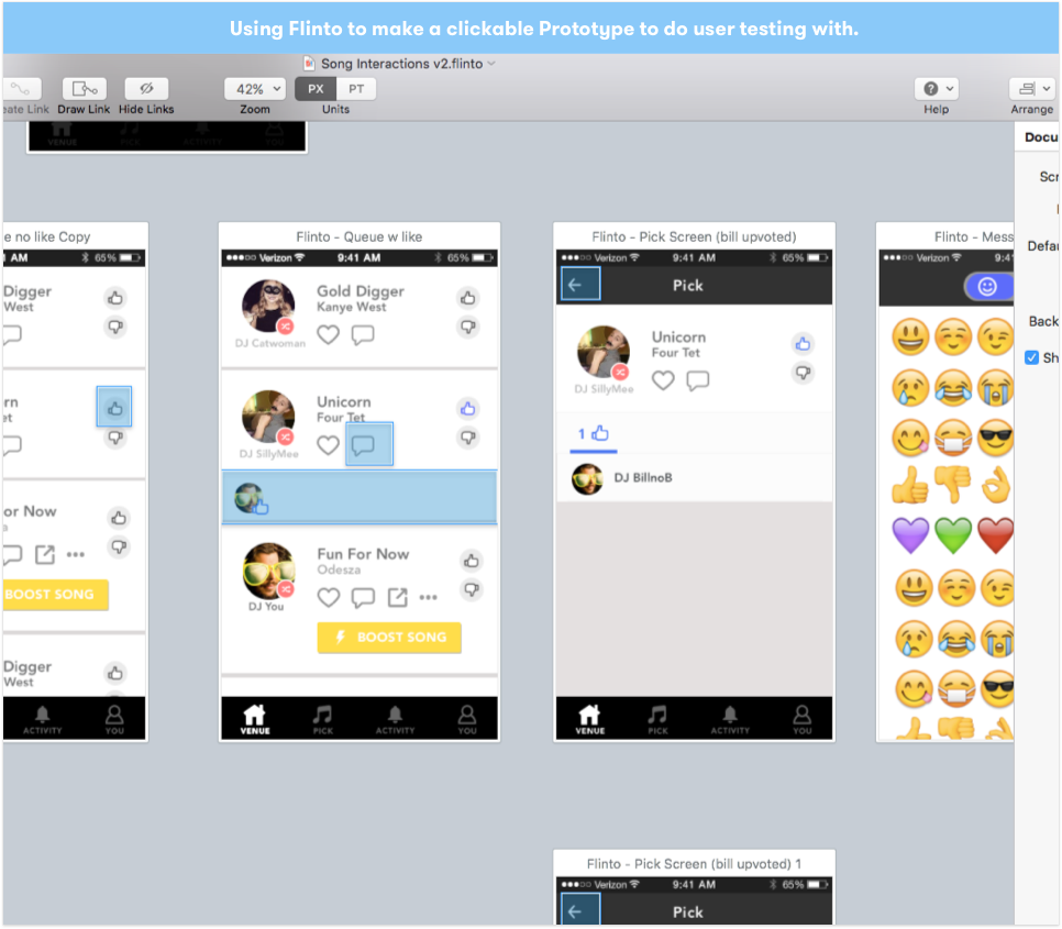
Organizing and facilitating a design sprint to kick-start ideas.
I had just read The Sprint Book by the guys over at Google Ventures. I thought this would be a great opportunity to try out a sprint at Rockbot. I bought the product team some donuts and we huddled in a room for the next week. I wanted to ensure the people who had been using the product the longest were involved, as I knew they would have great ideas on how it could be improved. This started the several month process of ideation, designing, and testing.

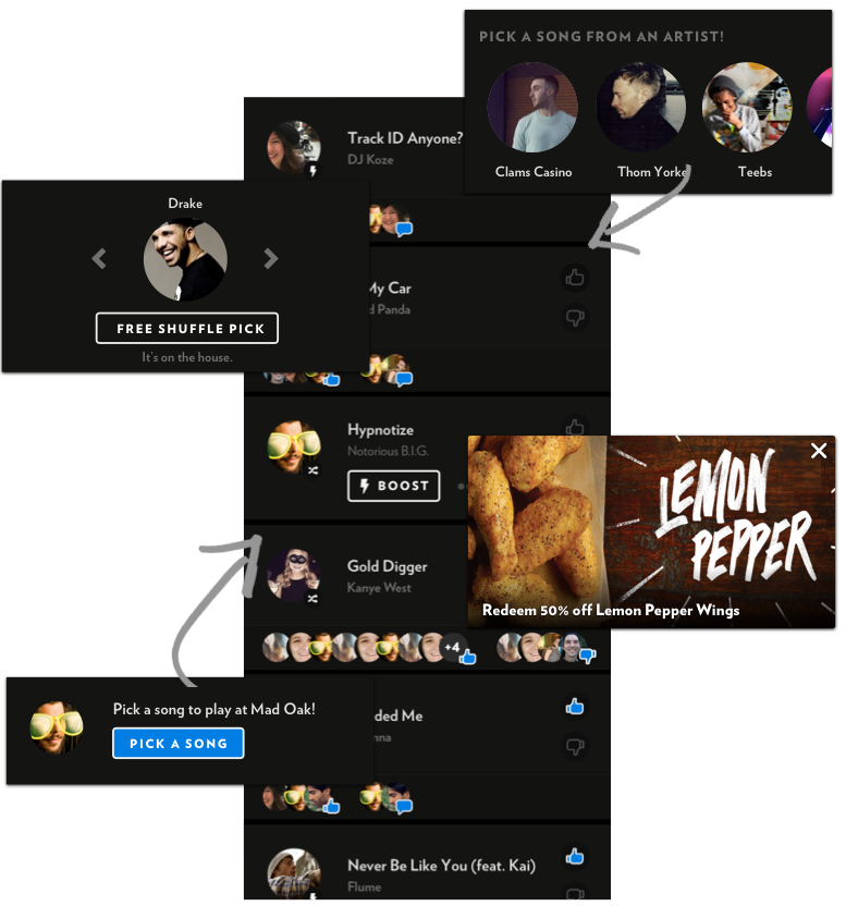
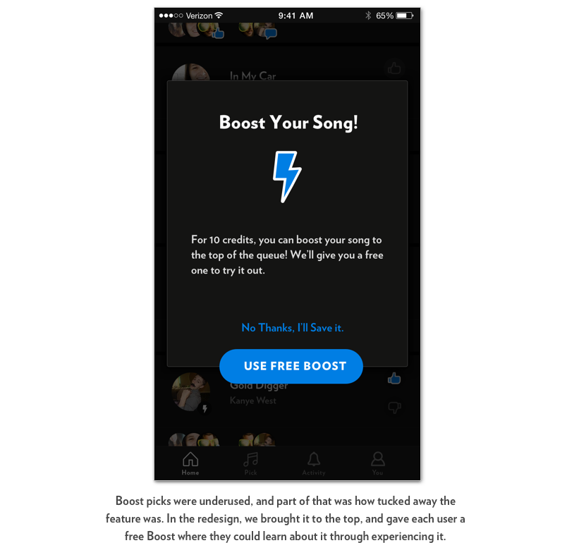
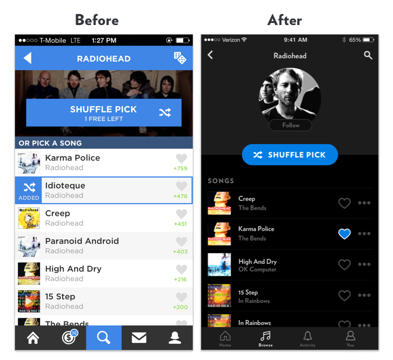
Fully dynamic upcoming music queue
One of the biggest improvements in this redesign was shifting to a fully dynamic queue. The queue is the homebase of the experience - a feed of the music that's playing, and will soon be playing in your venue. From conversations with businesses & users, we saw a huge opportunity to add value to the experience by showing ads, recommended artists, 1 - tap song picks, as well as new features of Rockbot.
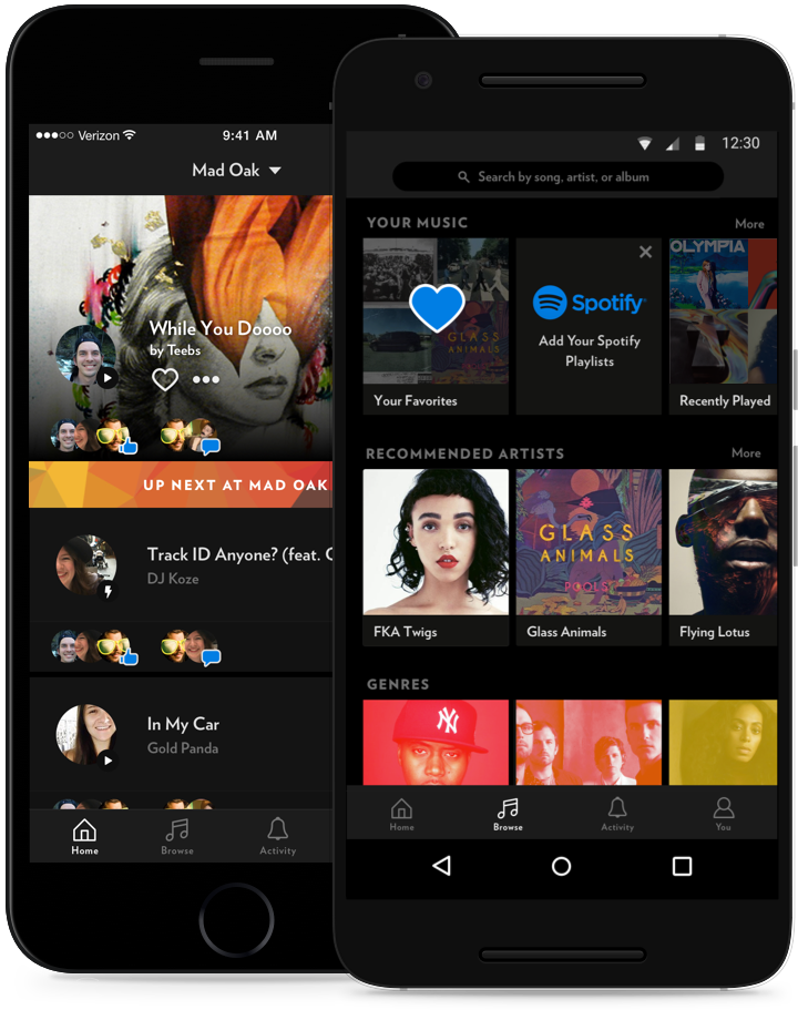
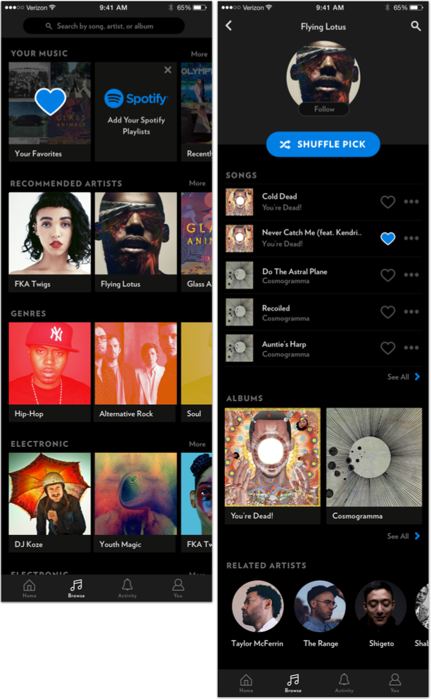
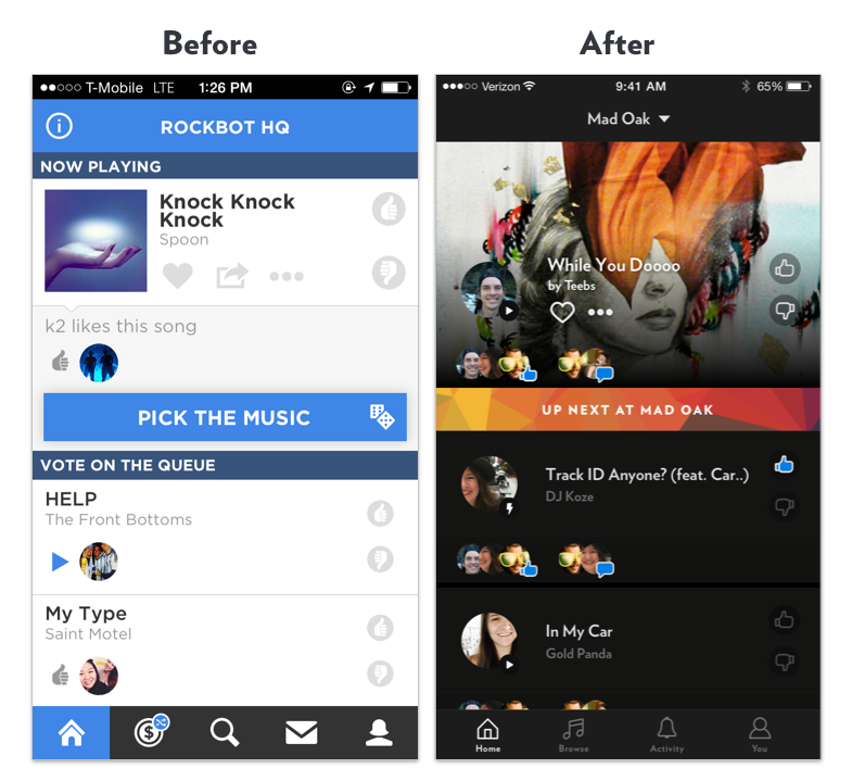
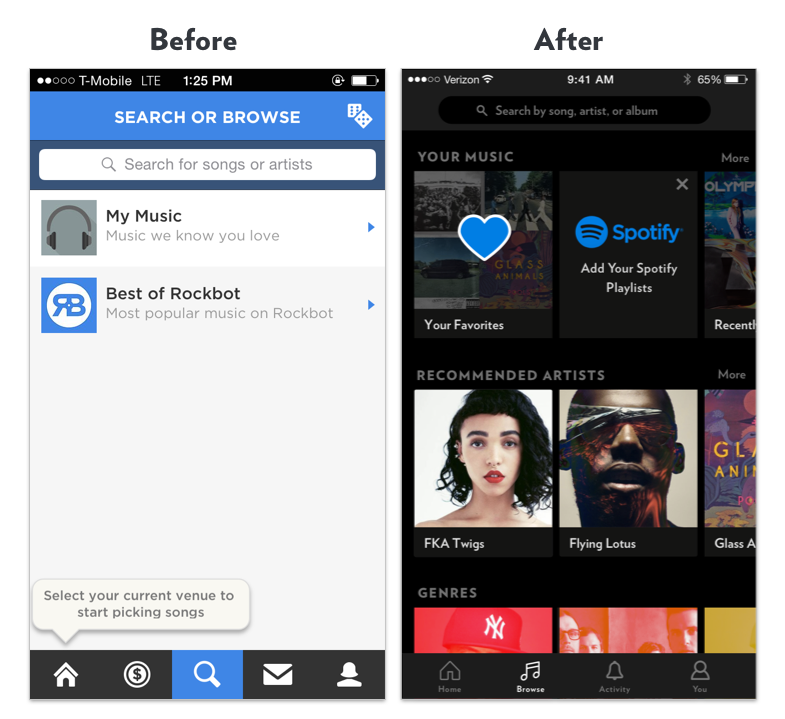
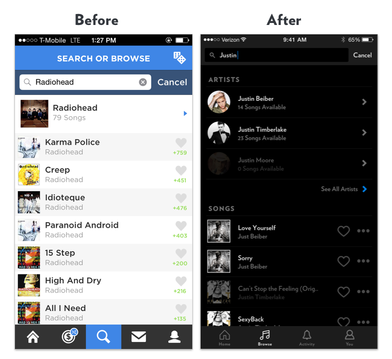
Improved music browsing experience - making finding music you love even easier.
The previous app left much to be desired when it came to finding music. It wasn't particually visual, and relied heavily on searching specific artists as opposed to allowing users to browse through artists we knew they liked. We wanted to simplify this experience and use the data we had around users music tastes to create an experience that was personalized, easy, and fun.
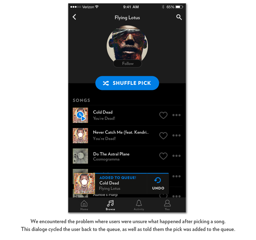
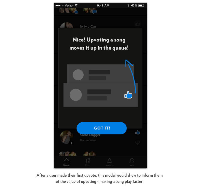
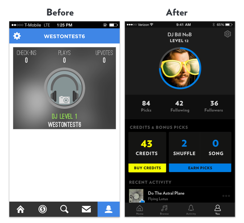
Improving the first-time user experience, to help users better understand how things worked.
While much of the prior Rockbot experience had interactions and rules that made sense, the application failed to inform users of those rules. For example, from talking to users, we learned that many didn't realize that upvoting a song resulted in the song playing quicker (in most cases). I wanted to close these gaps and design a system that was understood - no 'game' can be played without an understanding of it's rules.

Completely new look and feel.
The prior look and feel of Rockbot left much to be desired. We wanted it to feel fun, hip, and cool. With a new font and colors chosen, the foundation was laid out. Given how often users were using the Jukebox App in dimly lit enviornments, we saw an opportunity for a dark UI to be easier on the eyes.

Results
Designing and working with the Product Team on this app was an amazing learning experience. It allowed me to better understand some of the nuance of design decisions and constraints between iOS & Android, build experience designing for an application at scale (500k+ users), led a design sprint from start to finish, and also allowed me to flex my end to end skills as a designer.